Grant Insights: Improving a grant Detail page

a page outlining the details of a grant goes from simple to sophisticated

UX design

web design

Grant Insights: Improving a grant Detail page

a page outlining the details of a grant goes from simple to sophisticated

UX design

web design

Grant Insights: Improving a grant Detail page

a page outlining the details of a grant goes from simple to sophisticated

UX design

web design

Deliverable

Web app design

Tools

Adobe XD, Confluence

disciplines

UX design, Web design

The Mission

The Mission

In navigating the complex and time-consuming landscape of Germany's grant system, stakeholders from small businesses to researchers face the significant challenge of diverting valuable time away from their primary missions into the cumbersome grant application process, often with uncertain outcomes.

The web app in this case study aims to streamline this journey. You’ll discover how I optimized the grant detail page for optimal readability and efficiency.

The Before

The Before

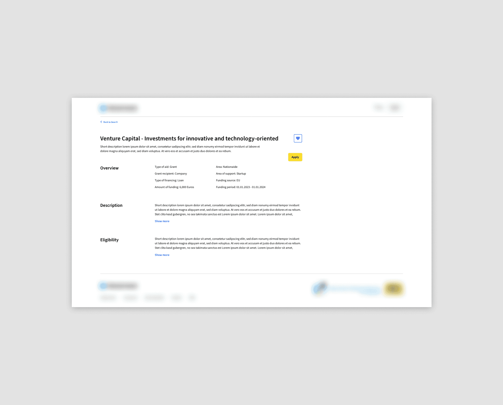
A quickly drawn up version of the page by another designer, ready to be optimized.

Issues included:

  • Inefficient information architecture

  • No definition of what happens when texts get longer (e.g. when the title gets longer than one line)

  • No optimization of text box widths for legibility

Information Architecture: Core

Beyond fixing obvious issues, what’s important for the user got revealed by examining the user journey:

  • In a previous step, the user was on the overview page and then selected a grant to examine more closely.

  • Now arriving on the detail page, they will want to know whether they qualify for the grant, before they invest more time into the page.

Knowing this, I reordered the main sections to reflect this, see image.

Information Architecture: Details

Information Architecture: Details

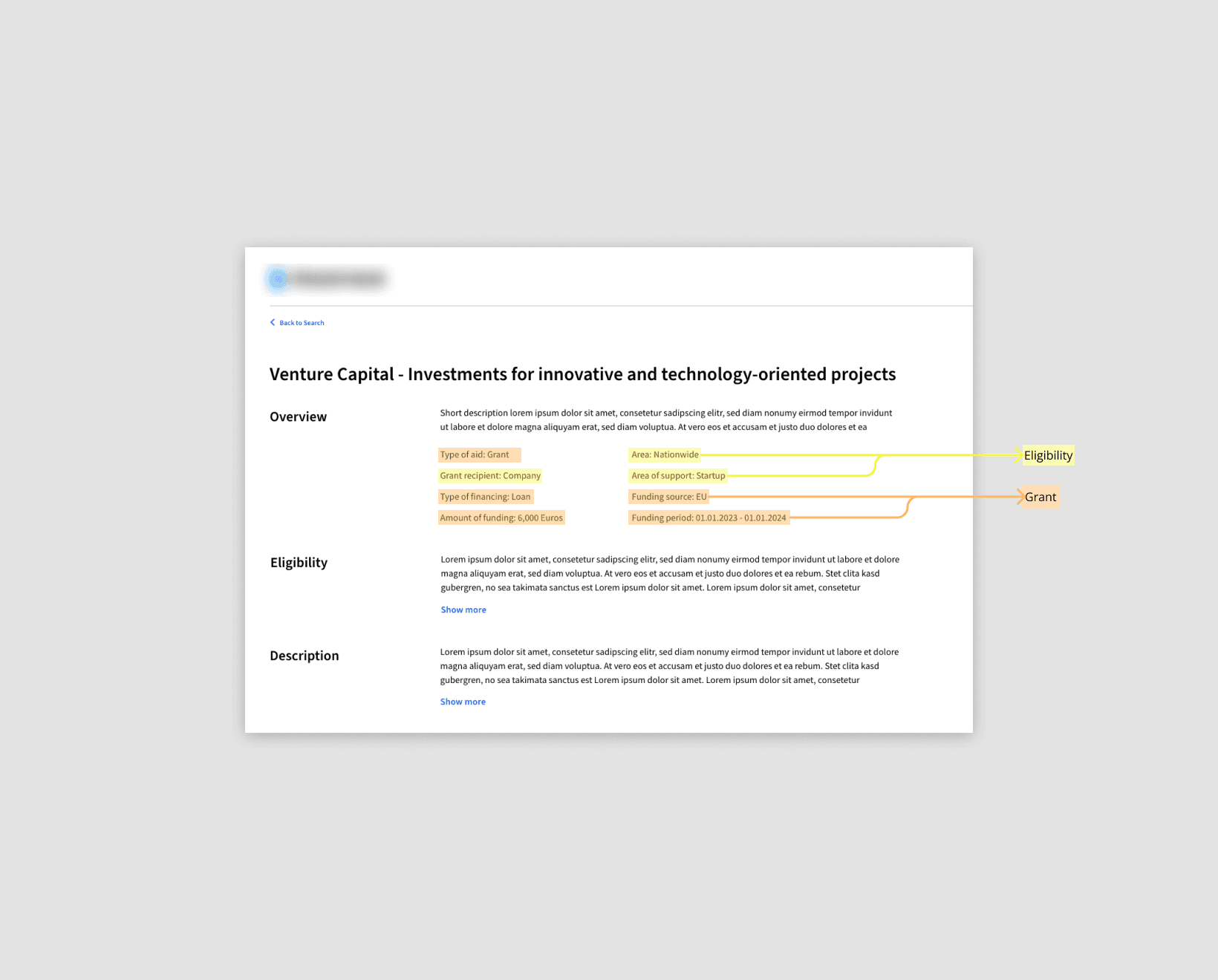
The next step was about optimizing the content in each section. My suggestions included:

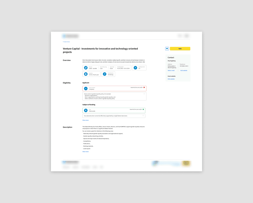
  • Grouping some of the 'quick facts' in the overview section under a new parent category to reduce their number and provide a clearer overview.

  • Converting a dense block of text into a more intuitive format by extracting important details and presenting them as distinct data points, like 'Area: Nationwide

  • Visual considerations for quick scanning, like adding icons

Initial Design

Based on the considerations mentioned, I designed the page as depicted.
It features:

  • Information architecture structured according to item importance, in a clear manner

  • Logical categorization of items

  • An overview section with both short summary and visually highlighted quick facts

The MVP Version

The MVP Version

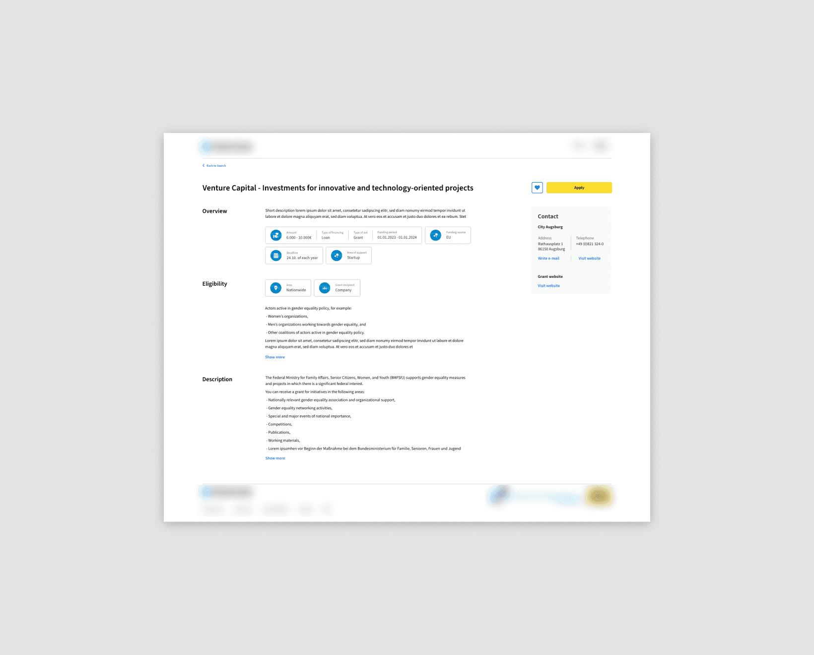
Developer feedback highlighted the necessity for a solution that could be developed more swiftly for the upcoming Minimum Viable Product.

This led me to simplify certain elements for faster implementation, like the visually highlighted tags.

Ideas for the future

To make the “Eligibility” section even more efficient in the future, I documented further enhancements to its display:

  • Either updating the CMS for clearer, more structured eligibility information from the get-go, or

  • Automatically converting the submitted text into digestible formats, such as checklists.

Displayed is a checklist combining

  • Eligibility parameters that get automatically checked off based on the user's profile information, and

  • Additional ones the user has to check off manually.

Key Insights

Key Insights

Efficient information architecture

Understanding and responding to the user journey within the grant application process was crucial.

Understanding and responding to the user journey within the grant application process was crucial.

Simplification for developer efficiency

Finding a balance between design complexity and development efficiency is always fun.

Key Insights

Efficient information architecture

Understanding and responding to the user journey within the grant application process was crucial.

Simplification for developer efficiency

Finding a balance between design complexity and development efficiency is always fun.

Grant Insights: Improving a Grant detail Page

a page outlining the details of a grant goes from simple to sophisticated

UX design

web design

Grant Insights: Improving a Grant detail Page

a page outlining the details of a grant goes from simple to sophisticated

UX design

web design