Gear Shift: Enhancing a car dealership app

Improving the News page's usability and information delivery for more user engagement

UX design

Gear Shift: Enhancing a car dealership app

Improving the News page's usability and information delivery for more user engagement

UX design

Gear Shift: Enhancing a car dealership app

Improving the News page's usability and information delivery for more user engagement

UX design

Quick Facts

Quick Facts

Deliverable

App design

Tools

Adobe XD, Confluence

Disciplines

UX design

The Problem

The Problem

The Problem

While the only designer on a team servicing a leading car manufacturer, I was tasked one day with the redesign of the 'News' page of our dealership app.

This page, critical for keeping sales teams informed about new models, app updates, and other vital information, was falling short of its potential.

The Problem

While the only designer on a team servicing a leading car manufacturer, I was tasked one day with the redesign of the 'News' page of our dealership app.

This page, critical for keeping sales teams informed about new models, app updates, and other vital information, was falling short of its potential.

The Before

The Before

User feedback revealed key issues:

  • The page's information architecture was leading to confusion,

  • Dense text obscured the urgency of certain information, and

  • The language used wasn’t engaging.

Explorations: Layout

Explorations: Layout

At first, I explored different page layouts, but quickly realized that the quick accessibility and prominence of important news items was crucial.

This meant working on a solution that offers full immediate visibility of a “featured” news item on entry, along with a list of teasers for the remainder.

Entering the Page

The user can enter the News page:

  • Through the main sidebar, or

  • Through the home screen’s News section.

The latter offers a preview of the newest news items. It communicates important news right when the user opens the app and sparks their curiosity.

Considerations & Constraints

Considerations & Constraints

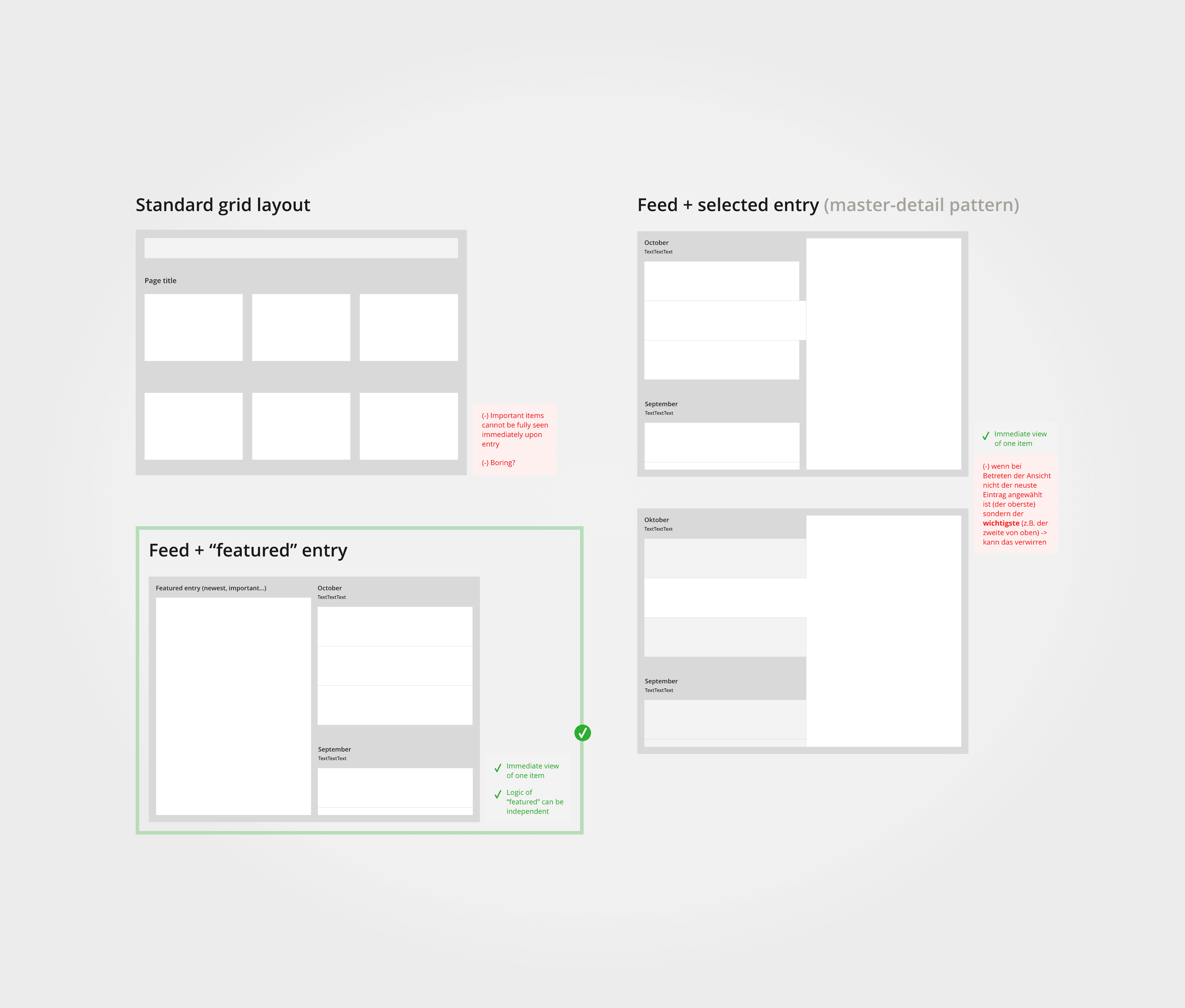
  • Key news has to be quickly accessible to ensure user visibility and engagement.

  • Result has to keep users’ attention.

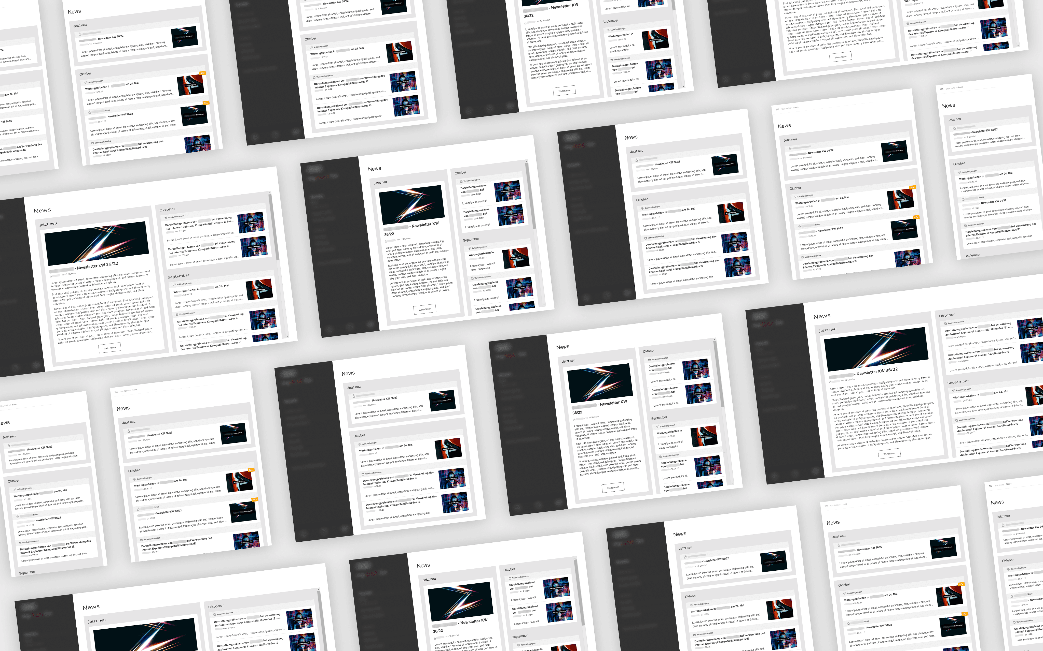
  • Designed for tablet use with future mobile compatibility.

  • Limited user testing capacity due to specific project constraints and company policies.

  • Usage of existing design system components.

Success Metrics

Success Metrics

Measured by gathering peer feedback:

  • Minimal navigation effort to reach important ‘News’ items

  • Overall improved information architecture

  • Visually more engaging than before

Measured by tracking user actions on ‘News’ items, such as app updates following related news reads:

  • Increased user awareness of important ‘News’ items
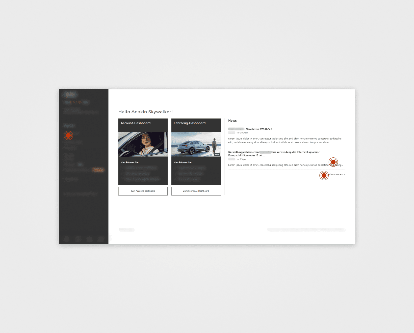
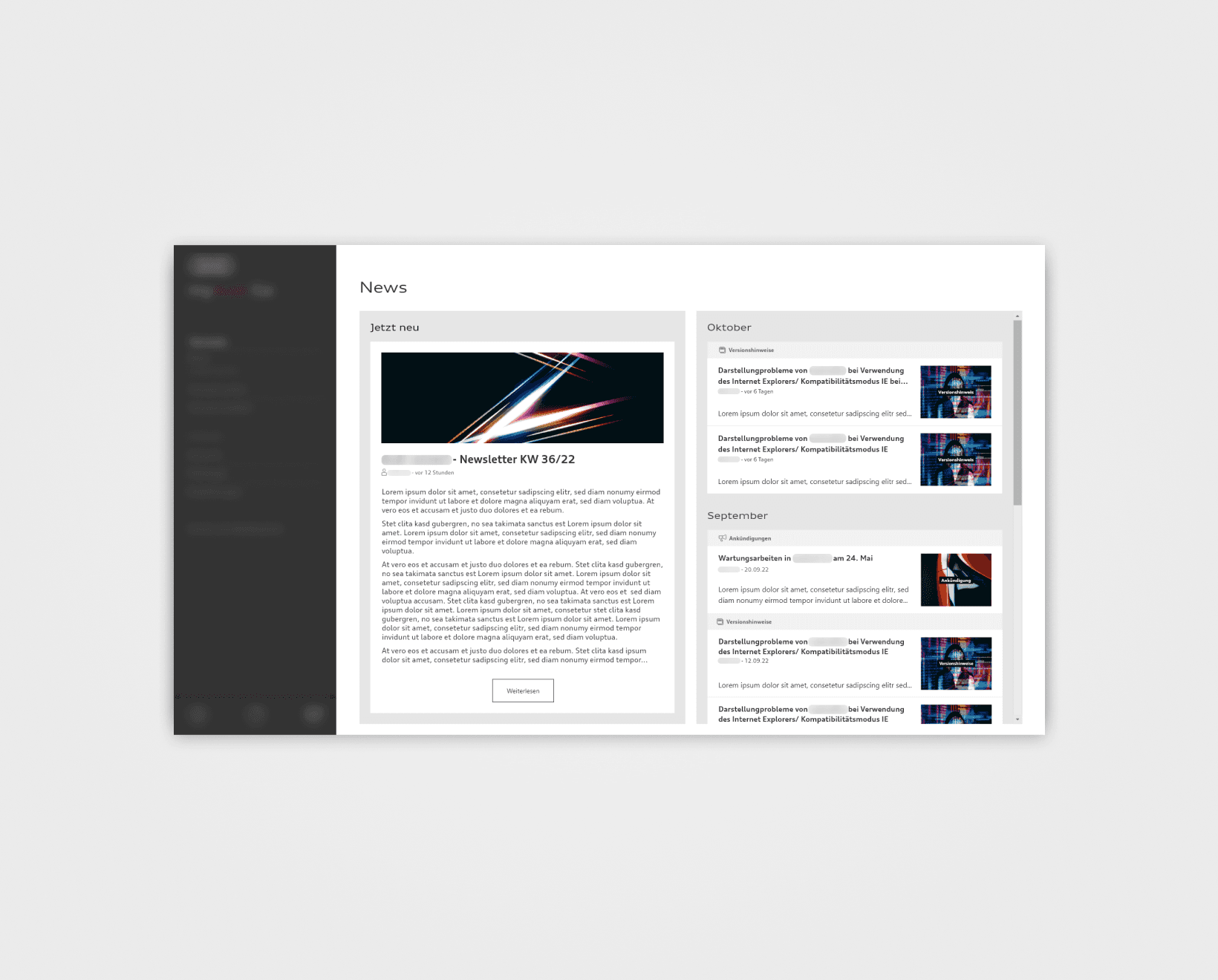
The Solution

Entering the Page

The user can enter the News page:

  • Through the main sidebar, or

  • Through the home screen’s News section.

The latter offers a preview of the newest news items. It communicates important news right when the user opens the app and sparks their curiosity.

The Page

The Page

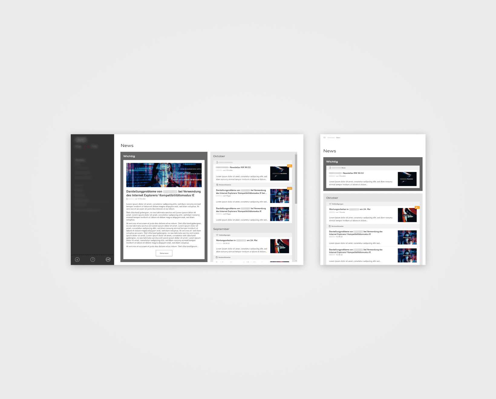
Once on the page, the user sees:

  • The featured news item in the left panel

  • The list of the other news on the right

This ensures immediate attention on the featured item upon entry.
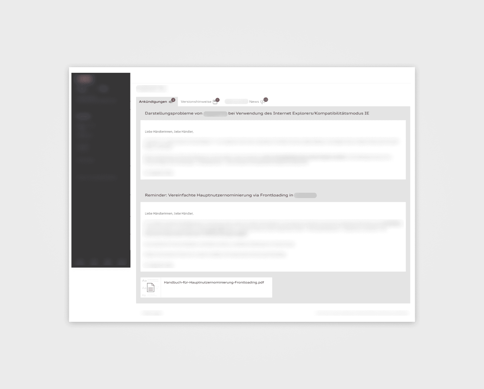
Selecting any news item leads to a detail page.

Logic: Display of News Types

Logic: Display of News Types

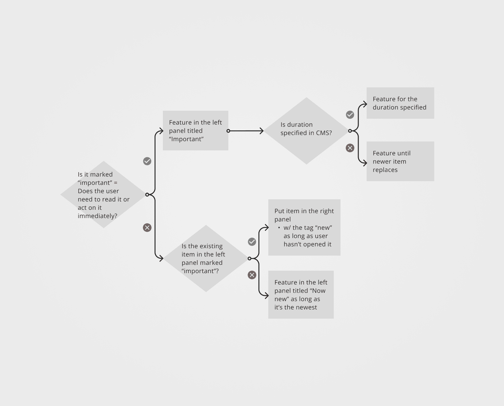
One type of news item needed timely user action.
I suggested to highlight it by

  • Expanding CMS functionality, so any post can receive an 'urgent' tag, and

  • Visually distinguishing them.

You will see a diagram explaining the placement and display logic for any given new post.

Display of News Types

Display of News Types

Depicted you can see how ‘urgent’ items are visually highlighted (dark gray outline).
The page has two main panels:

  • Left & right on wider screens, and

  • Top & bottom on narrower ones.

If there is a news piece marked ‘urgent’ in the CMS

  • It will be featured in the left (or top) panel and

  • Other, incoming and non-’urgent’ news pieces will be listed in the other one.

If there is no ‘urgent’ item, the newest item will be featured on the left (or top).

Key Insights

Key Insights

Efficient information architecture

It played an important role here because information hierarchy made the following design possible, including the layout and the structuring of news items into understandable categories.

UI design for clarity

UI was crucial for effectively differentiating between categories of news (e.g., ‘featured’, ‘important’, ‘new’) through the use of color, typography, and layout, ensuring that users can quickly identify and prioritize content that requires immediate attention.

Gear Shift: Enhancing a car dealership app

Improving the News page's usability and information delivery for more user engagement

UX design

Gear Shift: Enhancing a car dealership app

Improving the News page's usability and information delivery for more user engagement

UX design